Performance by Profile is the second panel of the Dashboard. It’s a per-profile leaderboard, intended for agencies – every Upwork profile linked to your Upwex team gets one row, and a Total row at the bottom sums every column.
What’s in the table
Each row represents one Upwork freelancer profile. The first column groups together avatar, display name, and email. The remaining seven columns are the core bidding KPIs.
- Profile – circular avatar (initials if no profile picture is available), name, email below in a smaller grey font. Picked up automatically when the profile is synced via the Chrome extension.
- Proposals – total proposals submitted on Upwork from this profile in the selected period.
- Replies – replies received from clients on this profile.
- Reply % – Replies ÷ Proposals. Colour-coded with the same thresholds as Activity Summary: ≥ 10% green, ≥ 5% yellow, < 5% red.
- Invites – invitations from clients to apply.
- DM – direct messages initiated by clients without a prior proposal.
- Offers – formal offers received (the Upwork “Send Offer” step).
- Connects – total connects burned by this profile (base bids + boost).
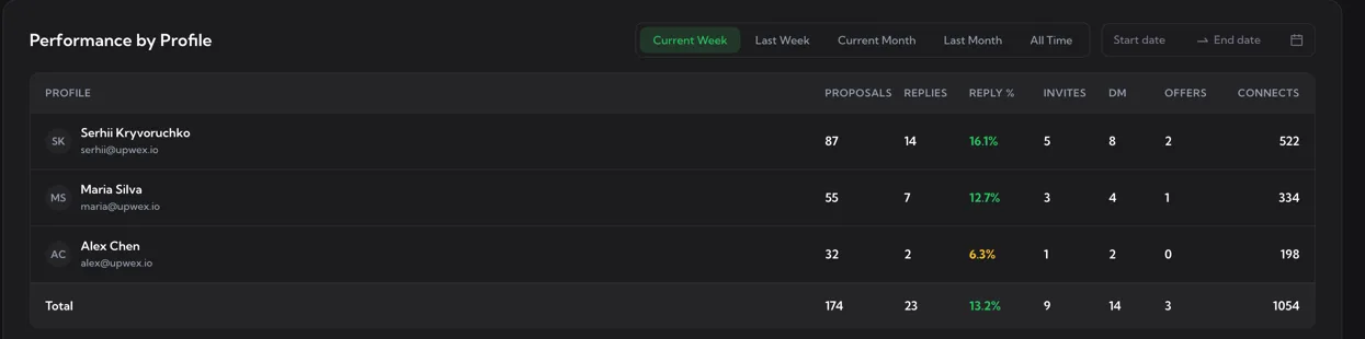
The Total row
The shaded row at the bottom of the table is not a member – it’s the team-wide aggregate. It uses the same Reply % colouring rules, so at a glance you can tell whether the agency as a whole is performing well even if individual rows look uneven.
Filters
The panel header has two filter blocks.
- Period chips – Current Week, Last Week, Current Month, Last Month, plus an extra All Time chip that other panels don’t have. All Time is useful for evaluating profiles you joined the team with months ago.
- Date range picker – Start date → End date. Picking a custom range overrides the chip selection.
This panel is the only one on the Dashboard without a member picker – that’s by design. The whole point of the table is to compare profiles side by side, so filtering to a single profile would defeat it.
How to use it as a manager
- Spot underperformers fast – sort the team mentally by the Reply % column. A red cell on someone with high Proposals usually means their cover-letter prompt or matching threshold needs attention.
- Connects budget control – the Connects column shows who’s spending the team’s connects most aggressively. Pair it with Reply % to decide whether the spend is justified.
- Onboarding ramp – new freelancers should show a rising trend in Invites and Replies as their profile gains traction. Toggle the panel to Last Week vs Current Week to compare two equal-length recent windows.
- Inbound vs outbound mix – high Invites + DM relative to Proposals on a profile means clients are coming to that person organically. Worth looking at what their profile content does differently.
Empty state
If you haven’t synced any Upwork profiles into Upwex yet, the panel renders an empty state with an inbox icon and a “No data” caption. Sync at least one profile via the popup’s Sync button (or the Profile Sync widget on Upwork) and the table will populate at the next dashboard load.
Where the numbers come from
Every metric in this table is calculated by Upwex’s analytics service from the events the Chrome extension records as your team bids. The table is not a live ticker – values aggregate daily, so today’s column may take a few minutes to update after a proposal is submitted or a reply is received.