Dashboard overview
How the six panels of the Upwex Dashboard work – Activity Summary, Performance by Profile, Proposals & Replies, Trends & Insights, Auto-Bidding Activity, Activity Heatmap.
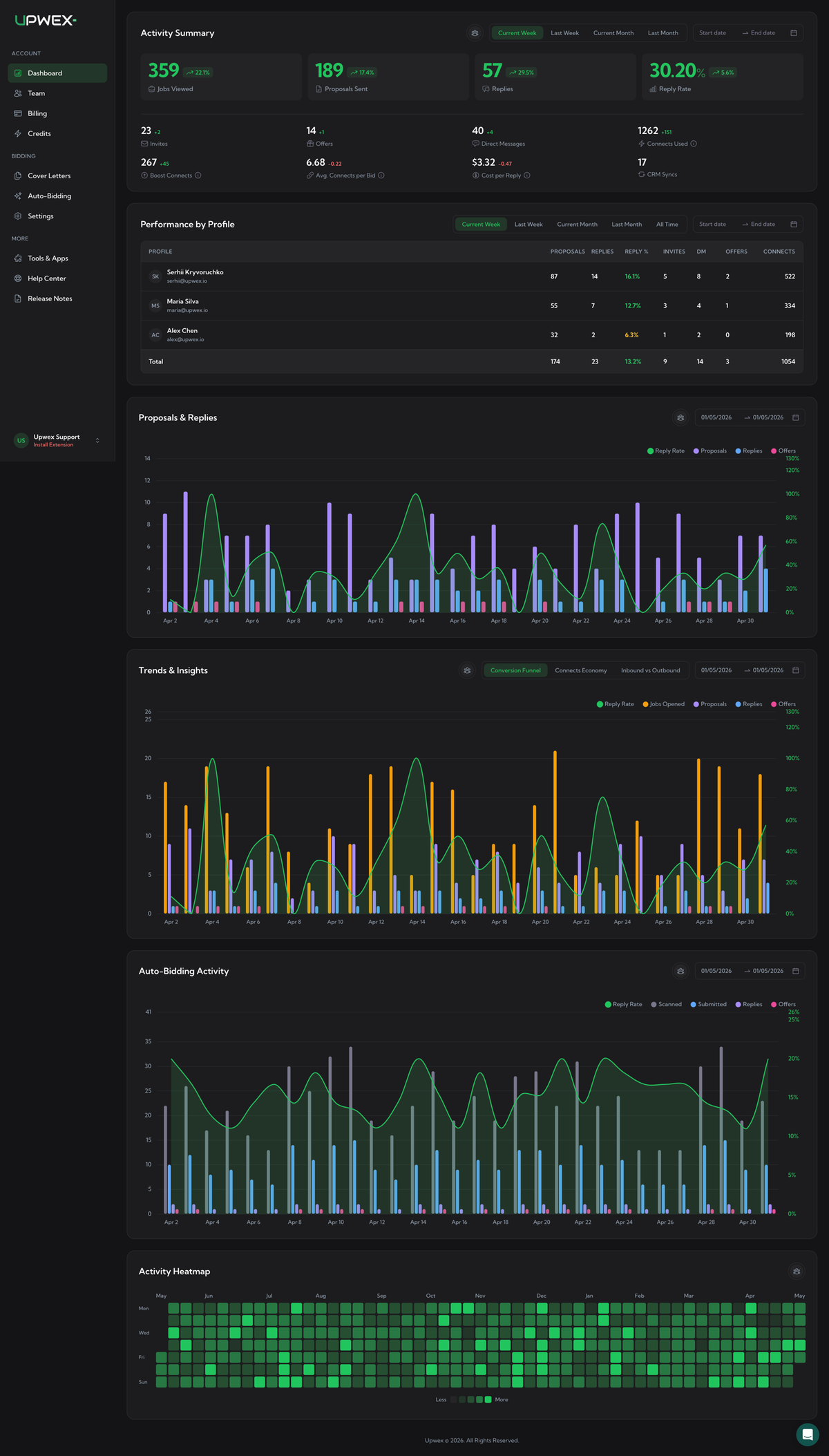
The Dashboard at account.upwex.io/dashboard is your team’s command-center for Upwork bidding performance. It pulls data from every Upwork profile linked to your team and shows it as six independent panels – each with its own filters, so you can slice activity by member and by date without affecting the rest of the page.
What’s on the page
The dashboard renders six panels stacked top-to-bottom. Each panel has a title in the top-left and a row of filters on the right.
- Activity Summary – four hero metrics (Jobs Viewed, Proposals Sent, Replies, Reply Rate) plus 6+ secondary metrics. Each value compares the current period against the previous one and shows a green ↗ or red ↘ delta. Detailed breakdown in the Activity Summary article below.
- Performance by Profile – table with one row per Upwork profile linked to your team. Columns: Proposals, Replies, Reply %, Invites, DM, Offers, Connects. The Reply % cell is colour-coded. Bottom row sums every column. Full walkthrough in the Performance by Profile article.
- Proposals & Replies – daily stacked-bar chart. Bars: Proposals (purple), Replies (blue), Offers (pink). Green line overlay: Reply Rate %.
- Trends & Insights – three tabs that share the same date range:
- Conversion Funnel – Jobs Opened → Proposals → Replies → Offers, plus Reply Rate line.
- Connects Economy – Connects Used vs Proposals, plus a Connects-per-Bid line.
- Inbound vs Outbound – outgoing Proposals against incoming Invites, Direct Messages, and Offers.
- Auto-Bidding Activity – daily bars for Scanned, Submitted, Replies, Offers (the Auto-Bid pipeline) plus Reply Rate line. Pulls from a separate Auto Bid endpoint.
- Activity Heatmap – a calendar heatmap of the current year. Each cell is one day, coloured by total activity (bids + replies + opened jobs + invites + DMs + offers). Lazy-loaded – it fetches only when you scroll it into view.
Filters
Each panel manages its own filters; changing a filter on one panel doesn’t affect the rest.
- Period filter – a row of preset chips (Current Week, Last Week, Current Month, Last Month; Performance by Profile also has All Time). Activity Summary is selected to Current Week by default.
- Custom date range – a Start date → End date picker on the right of each panel. Picking dates overrides the preset chip.
- Member picker – small avatar button in the panel header. Pick All Members to see team-wide totals, or pick a specific member to filter the panel to their activity. Performance by Profile has no member picker – it always lists every profile and that’s the point.
How to read the colours
- Reply Rate % on Activity Summary, Performance by Profile, and chart line overlays uses the same thresholds: ≥ 10% green, ≥ 5% yellow, < 5% red.
- % change badges next to hero metrics: green ↗ for improvement, red ↘ for decline. Connects Used and Boost Connects flip the rule (lower spend is better, so a decrease shows green).
- Bar chart palette – Proposals always purple, Replies blue, Offers pink, Invites green, Direct Messages amber, Connects orange, Jobs Opened amber. The Reply Rate line is always green and uses the right-hand axis (percent).
Data freshness
The dashboard reads from Upwex’s analytics API which is fed by the Chrome extension as you bid. It is not a live ticker – events are aggregated daily, so today’s numbers may take up to a few minutes to update after you submit a proposal or receive a reply. Activity Heatmap is fixed to the current calendar year and never includes future months.
Empty and loading states
- Loading – green-tinted shimmer placeholders on metrics and tables; Loading… overlay on charts.
- Empty – charts show a “No data for the selected period” message with an icon. The Performance by Profile table shows “No data” with an inbox icon if you haven’t synced any Upwork profiles yet. The heatmap simply renders with no green cells.
What’s next
Once you understand the layout, the two panels you’ll spend the most time on are the top two – Activity Summary (your day-to-day numbers) and Performance by Profile (per-profile leaderboard for an agency).